
Website re-design optimized to
increase donations

Problem
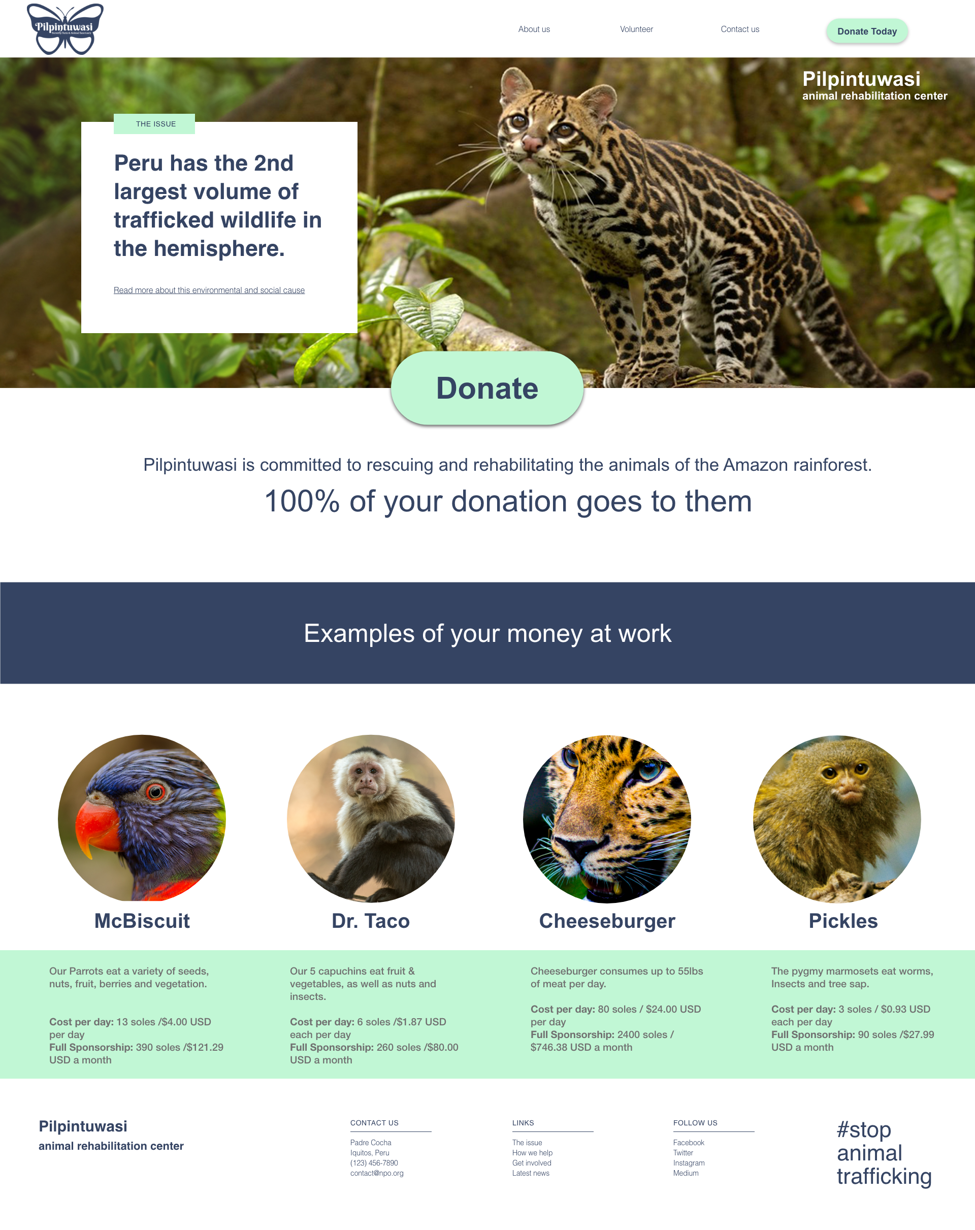
Pilpintuwasi Butterfly Farm is an animal sanctuary located in Iquitos, Peru, run entirely on donations. However, the sanctuary’s current existing website lacks a user-friendly design and easily accessible pathway to their donations page.
The current website design includes a very small donation button on an outdated website, including a confusing “menu” of options on their sponsorship page. Clicking on the donate button takes users to PayPal where a foreign email address seemingly unassociated with the organization is listed as recipient. This leaves the user confused and not confident that their donation payment is secure and legitimate.
How can we help Pilpintuwasi to improve their overall visibility and increase the amount of donations received with little cost to the organization?
Solution
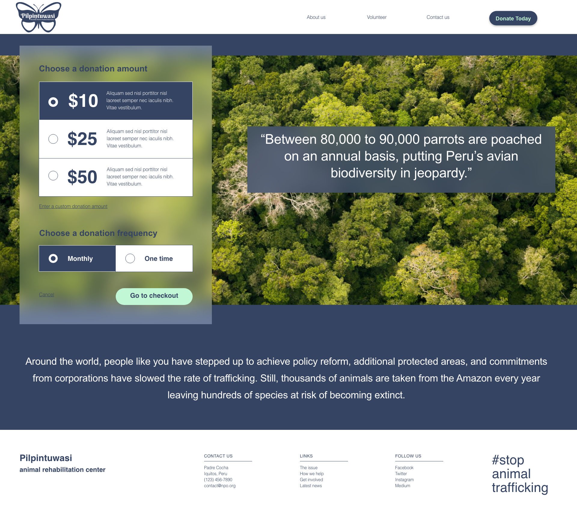
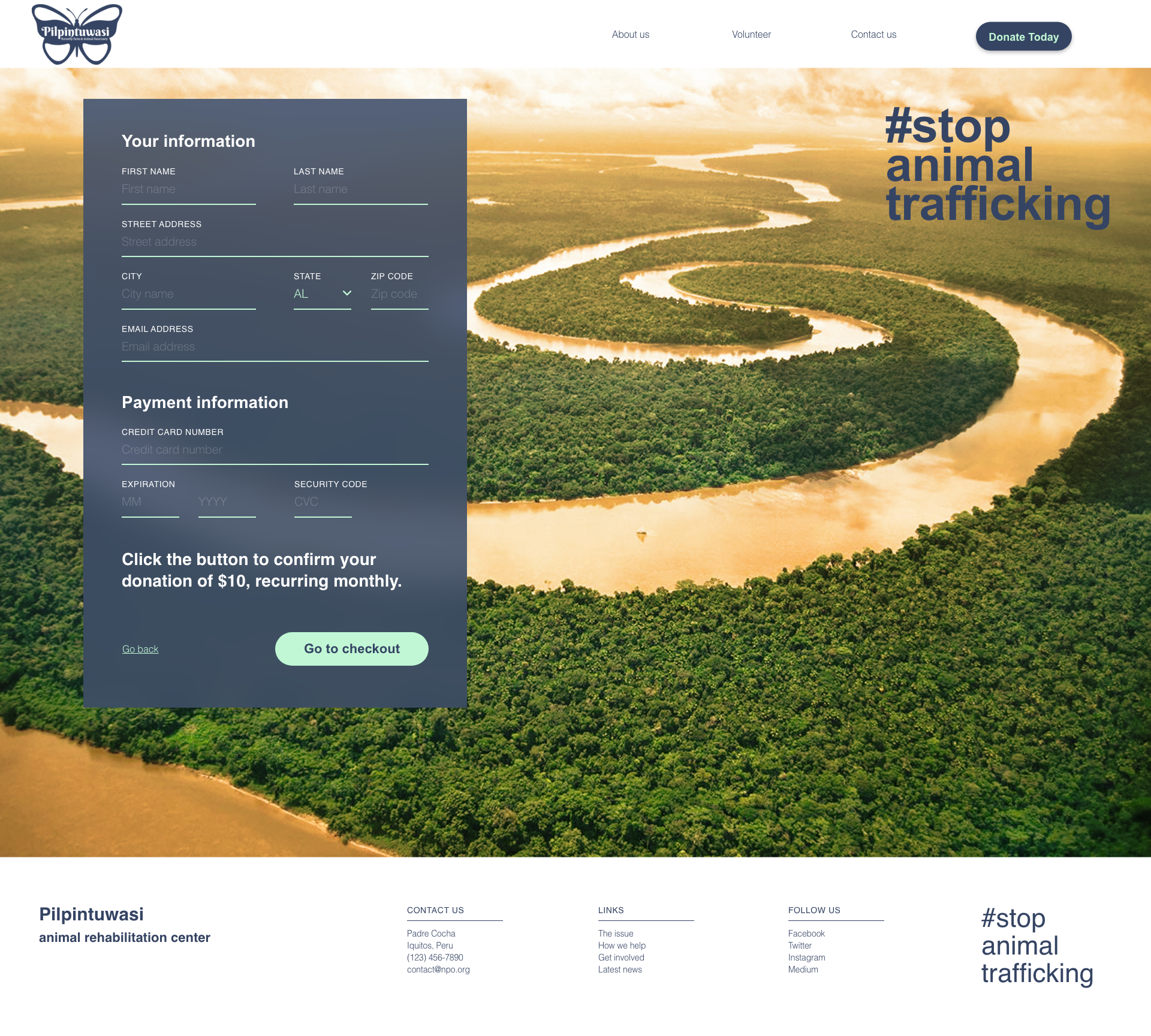
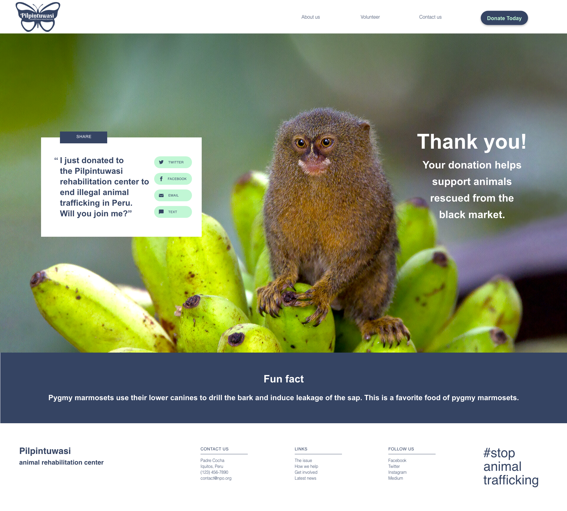
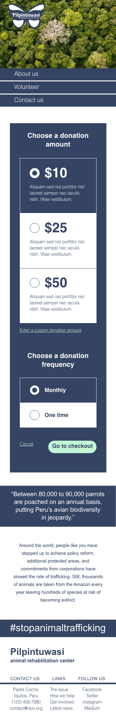
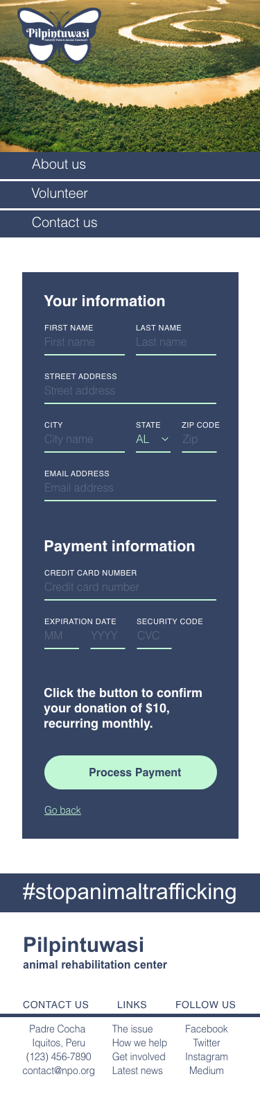
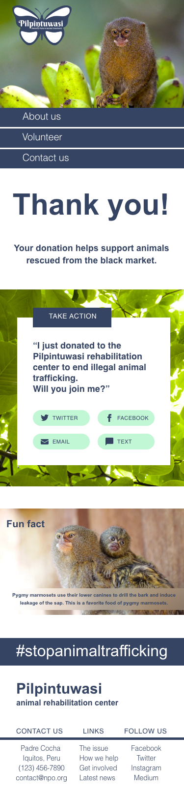
After researching and comparing other similar organizations with higher donation yields, I determined that a website redesign was the best solution. The new website features a clean and updated design as well as a simplified layout. The donation button is prominently featured on all pages to limit the clicking around the user will need to do.
The redesign allows the user to navigate the website more easily, and which could lead to more visitors to the site, more overall visibility for the organization, and quicker more user-friendly way for visitors to donate.
Before
AFTER
User research
I began my formative research by visiting other non-profit websites, noting common features across the organizations with higher donation yield. I also reviewed literature and current statistics pertaining to building non profit websites and how to increase donations.
I found that on higher yielding organizations’ websites, the donation buttons were highly visible across the board. Most buttons were large and featured on the homepage as well as other pages. Almost all buttons used a complimentary yet high contrast color to grab the users attention.
I also found that U.S.-based nonprofits tend to raise less per user than international non-profits, and that half of nonprofit website traffic comes from mobile or tablet users. Mobile compatibility is important, but a simple, fast desktop site is equally important as 51% of high-wealth donors ($200k+) prefer to give online.
Custom logo
In 2009 the Neilson/Norman group posted their findings on a study titled “Donation Usability: Increasing Online Giving to Non-Profits and Charities”. In the study they tested 23 non-profit websites by observing the behavior patterns of potential users and gathering feedback. They were able to isolate the key information users want to see before donating, which are:
The organization's mission, goals, objectives, and work.
How it uses donations and contributions.
According to their findings, 43% of the websites tested included information on an organization’s mission, goals, and objectives on the homepage but only 4% included content about how donations are used. 17% of users couldn't find where to make a donation at all. Overall the main problems centered around difficult workflows, cluttered designs and confusing dialog.
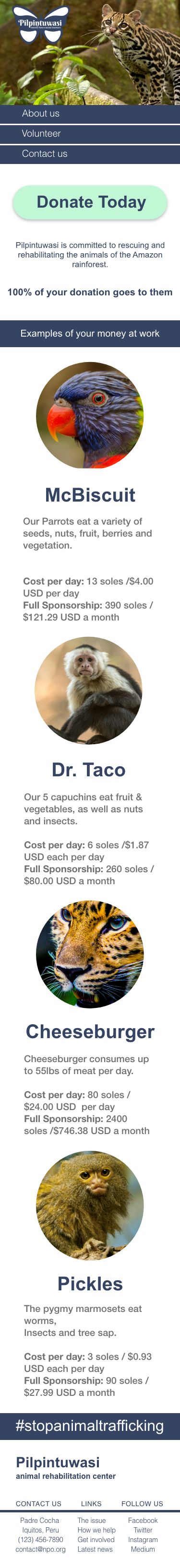
From my research and close review of the Pilpintuwasi website, I redesigned the site to with a simpler and cleaner user interface, with donations more prominently featured.
Mocks
Interactive prototype
Desktop donation sequence
Mobile donation sequence